Tuesday 13 March 2012

Update- Environment

So the last time I posted about the environment it was very basic and and I quickly realised I'm not a strong enough modeller to get my environments done in time, or looking how I want. So with permission I asked a friend of mine to take my basic environments and improve on it. 

So far only Bea's room, the stepping stone path and the gate/door environment has been finished. It's looking unlikely that I will have the time to do the main Garden environment with all the animals, but I am looking into using premade models from the Internet. This will save me time, as I am only focusing on the design and animation.

So here are some recent screenshots. I still need to texture everything and I am currently learning how to unwrap everything:

The bedroom, which will be edited in post to look grey and dull:
 Here is the tunnel stepping stone path, which is now surrounded by bamboo instead of bushes:
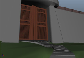
Here is the Gate scene, this is my favourite so far!
This is the main door at the top of the path, still needs tweaking but it's pretty much there:
 And here it is on the other side. The bushes looking very blob like but I intended everything to look a bit childish so it makes sense to me. Plus I may be painting over this particular shot to show the transition into the Garden:
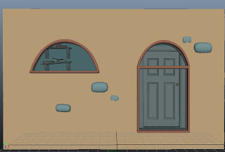

 A big thanks to my friend Alex Price (http://alexmprice.wordpress.com) who modelled most of this for me. After he helped me, I went in and tweaked the composition, shaped the bushes, modelled the gate and made a few smaller changes here and there. I just need to get texturing now!

Project Update- Character

Sorry for the delay in posts recently, deadlines are fast approaching!
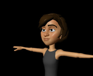
Here is a quick catch up with the character (not going too in depth, I'm saving that for the dissertation!):
 
For my main character I am using the highly customisable Morpheus rig. This is mainly because I am not a rigger or a strong modeller, so it allows me to quickly mould my character into the rig. I've modelled the hair onto her, and her clothes. I had some issues with altering the Morpheus rig's textures but after reading tons of forums I found the answers I needed.


It took a while to get the hair looking as close to her designs as possible, but it's turned out pretty nicely and I'm very happy with it.


Currently I've just finished skinning the jacket to Bea, and I also decided to give her a skirt made with ncloth. Which currently works really well:


However I haven't got much time for testing so I will have to animate her doing a walk, in my scene, and take it from there. If I get too many problems I will just stick to a mesh deformer and simple model skirt. I just have to figure out how to constrain the dress to her and I can start texturing!


Thursday 2 February 2012

3D Screenshot Update 2

While I'm sorting out the character rig, I have been blocking out my environments with very basic shapes. The main one is the scene with the gate. After she enters the door I'm going to start rendering basic 3D scenes and then painting over the top. This will be quicker and gives the illusion that she is entering a new world. Here are a couple of renders of my blockout so far (keep in mind they are very rough!):


3D Screenshot Update

Now that the animatic is done with I can move onto the 3D side of things. First off the rig:


I'm using the Morpheus Rig for my character to save me time and so I don't have to bother with the hassle of rigging (which isn't a strong point of mine). This rig is very good to use because it's very customisable, and also a good rig to animate with. I've pretty much finished her customisation using the tools I have been given. Although she still looks a little too old and it's difficult to get what I want from certain controls. However I still need to make her clothes and remodel her hair (My next job!). I also want to edit her texture a bit to make it look painted.

Here is a quick render of Bea:


Monday 30 January 2012

Animatic Version 2

This is the 2nd version of my animatic and the final version. I took all the suggestions that were given to me from CGCoach, tutors and friends, and tried to compile it all together so it flowed well. Many of the changes were things like moving the horizon line down, making the composition more interesting, adding new shots so it made sense and of course, adding in the origami animals (which I should have added first time round, seeming as they are the main spectacle)!  I hope you enjoy it, and any problems with timing etc will now be addressed in the 3D animation, as time is getting on.


Sunday 22 January 2012

Animatic Version 1

To help get a better idea of how my animation will play out, I have created an Animatic using Photoshop and Sony Vegas to get down the timing. I then showed this to a number of people from my society, CGCoach and various teachers, and got a lot of good feedback from it. Animatic Version 2 will be ready very soon, and then I can move properly onto shader testing and 3D modelling!

Here is the Animatic:


The middle section is the part that needs the most work, and from the feedback I received it was difficult to understand. I also break the 180 degree rule quite a bit, and I have now edited most of the scenes so they have better compositions (this will be in the update).

Wednesday 4 January 2012

Environments

The whole animation is about Bea leaving a cold,grey world, and entering a world full of colour and light. I wanted to reflect this in the colour scheme and lighting.

In the beginning of production Bea started in her dull grey room, trying to make origami. The paper plane she threw out of frustration then lead her out into the world. This has changed a little bit now in the Animatic, and I've tried to minimise the amount of time she spends in her room at the beginning. I have also cut out the part of the story where she was making Origami because it complicated the story and meant a great deal more animation would be involved.


Also in the early stages I planned for a chase through a small maze of streets. This involved passing through a giant red Japanese gate, which I found a photo of in reference photographs a family member took on their trip in Japan. The chase has now been moved to an outside area that slowly gets more colourful as time progresses. This takes place along an overgrown path which Bea playfully uses as stepping stones. I also tried to get a sense of scale into the shot, much in the same way Studio Ghibli do with their environments.


Finally the Garden that is the most colourful, vibrant and lightest area of the animation. I originally wanted pools of water with a waterfall, and a big expanse to show. However trying to simulate water in that way doesn't play to my strengths. So I've reworked the scene into layers which can appear to be bigger and further away than they actually are. Are there is still water in the scene, but this can easily be a moving texture or a very simplistic simulation. I tried to get a number of Japanese Garden iconography in there too just to make it a more interesting composition. I will colour the final image once the Animatic is finished.


Now onto the Animatic! It's 80% finished so I will upload it soon.